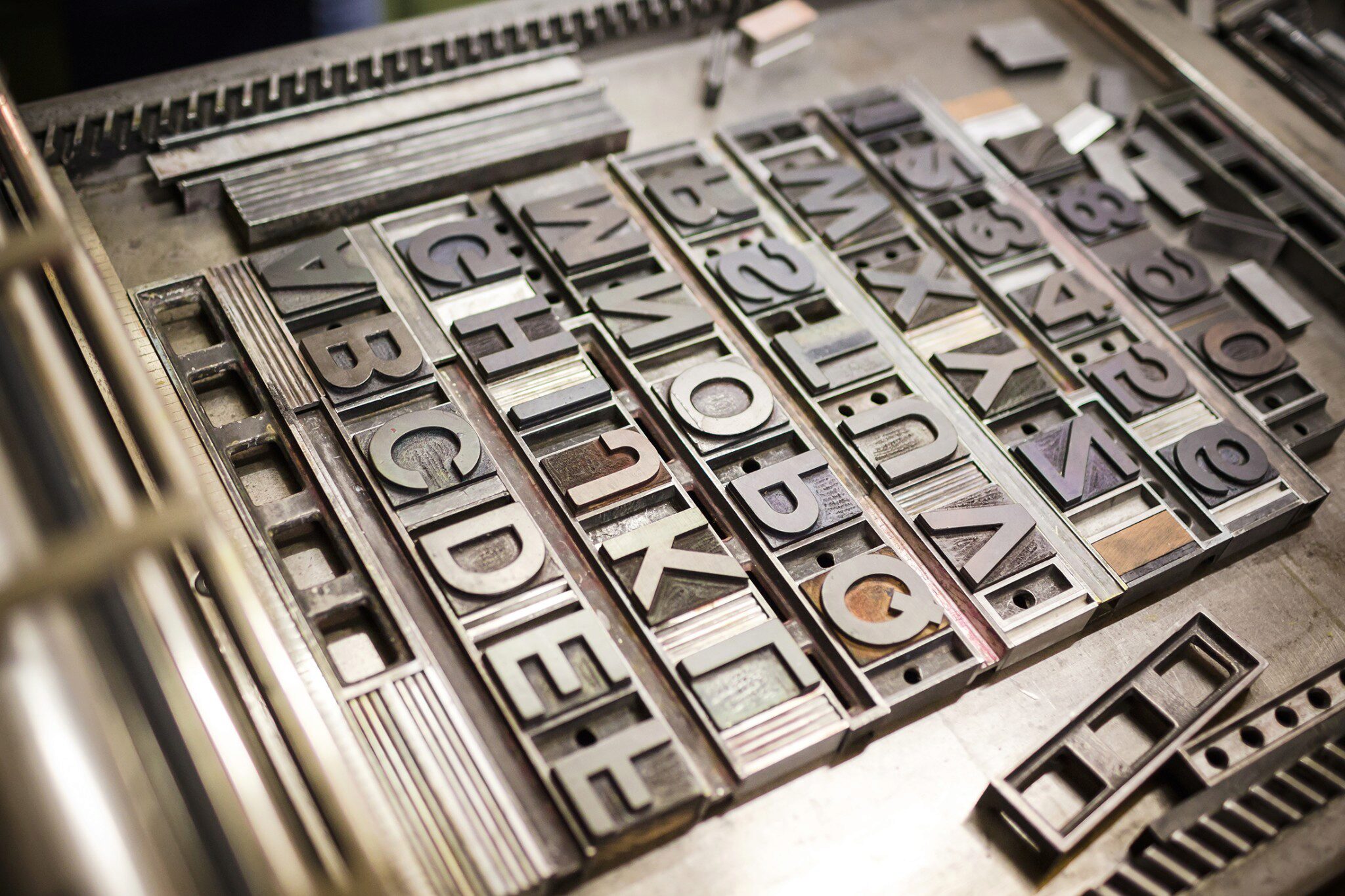
In 1957, Swiss designer Max Miedinger unveiled a typeface that would quietly reshape the way the world communicates. Originally called Neue Haas Grotesk, it was soon renamed Helvetica — a nod to Helvetia, the Latin name for Switzerland. The goal was simple: create a typeface that was modern, legible and above all, neutral.
Unlike decorative fonts that demanded attention, Helvetica was designed to disappear. It wasn’t meant to show personality or style; it was meant to let the words themselves speak. With clean lines, balanced proportions and a sense of quiet restraint, Helvetica gave messages room to breathe.
The world took notice. In the decades that followed, Helvetica became the most widely used typeface in modern history. Airlines, banks, corporations and even governments adopted it. It became the voice of brands like American Airlines, Jeep and Target, as well as the wayfinding system of New York City’s subways. Helvetica didn’t shout. It didn’t need to. Its very clarity made it powerful.
There’s a lesson here for every organization. In the rush to be heard, it can be tempting to add more — more words, more images, more flair. But often, the strength of communication lies not in what you add, but in what you take away. Clarity isn’t about saying everything; it’s about saying the right thing, simply and consistently.
At Bark, we see this often. Companies come to us with a powerful mission, but their story is buried beneath layers of complexity. They’re speaking in too many fonts at once — different tones, different messages and different looks. Our job is to help them find their Helvetica: a way of communicating that is clear, consistent and faithful to their identity.
Because the truth is this: the best communication doesn’t draw attention to itself. It points people to the message that matters most. And just as Helvetica gave countless organizations a voice that endures, clear communication can give your story the strength to be seen, heard and remembered.